

The Psychological Impact of Color 🧠 🧠
Colors have a direct influence on human emotions and behavior. Each hue conveys a different feeling that can range from tranquility to energy. Therefore, it is essential to understand the psychology of color when designing hotel spaces.
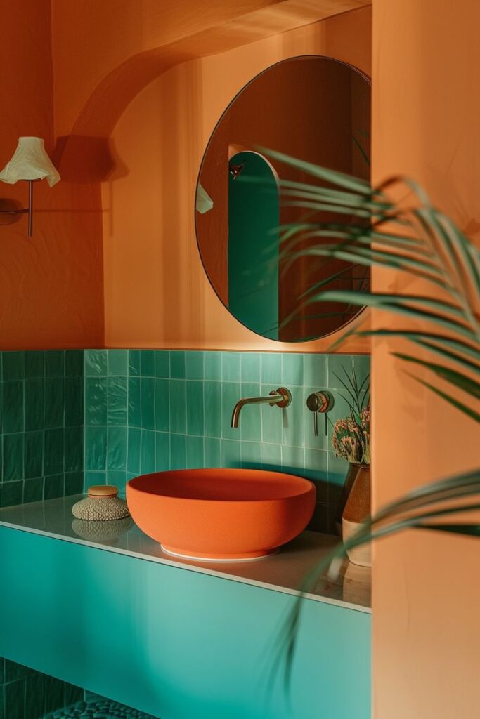
- Warm colors (red, orange, yellow): generate feelings of energy, warmth, and enthusiasm, but should be used sparingly to avoid saturation.
- Cool colors (blue, green, violet): evoke calm, serenity, and freshness, ideal for rest and relaxation areas.
- Neutral colors (white, beige, gray): provide balance and sophistication, serving as a base for highlighting decorative elements.
Colors in Key Hotel Spaces
Guestrooms: A Refuge of Rest 🛌
The guestroom is the place where guests seek to relax and recharge. Therefore, the colors chosen should foster an atmosphere of rest.
Recommended tones:
- Soft blues: associated with tranquility and restful sleep.
- Light greens: evoke freshness and a connection with nature.
- Beige and soft grays: convey neutrality and sophistication.
Tip: Avoid overly bright or saturated colors that can generate anxiety or discomfort.
Common Areas: Social Spaces 🛋️
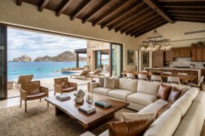
Lobbies, restaurants, and bars should encourage social interaction and enjoyment. Here, colors can be more dynamic and vibrant.
Recommended tones:
- Warm and earthy tones: such as terracotta or mustard yellow, which create a welcoming atmosphere.
- Red or orange accents: provide energy and vitality, perfect for entertainment areas.
- Black and gold: add a touch of elegance to exclusive spaces.
Spa and Wellness Areas: Relaxation Corner 🧘
In spaces dedicated to wellness, such as spas or gyms, it is crucial to create a relaxing atmosphere that encourages mental and physical rest.
Recommended tones:
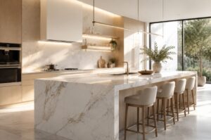
- Whites and creams: convey purity and cleanliness.
- Olive green or aquamarine blue: evoke nature and serenity.
- Stone gray: brings stability and calm.